Loading...

Loading...


Helmets with the latest Miami Dolphins logo await rookies and free agents for the first day of rookie camp at Nova Southeastern University on May 3, 2013. Joe Rimkus Jr./Miami Herald file
See the evolution of the Miami Dolphins’ logo since the team’s inception in 1966.


When the Miami Dolphins made their AFL debut in 1966, they did so with a helmet featuring a dolphin leaping through a sunburst in what is now an iconic orange-and-aqua color scheme. This logo would be tweaked a few times but basically remain the same until 2013.

Miami kept its original logo but the dolphin was centered in the middle of the sunburst. The Dolphins won a pair of AFC championships but lost Super Bowls 17 and 19 with this logo.

Miami didn't do much to change its look for the start of the 1990 season, but the colors on the leaping dolphin were darkened and the orange sunburst was brightened. The next change would be a little different but keep the same theme.

The Dolphins made their first radical change to their logo in Jimmy Johnson's second year as coach, making the leaping dolphin look a little meaner as well as more three-dimensional. Miami also added dark blue to its color scheme. The hashmarks in the sunburst were also removed for the first time. The Dolphins introduced orange jerseys during this time as well as an alternate logo with the dolphin catching a football minus the sunburst.

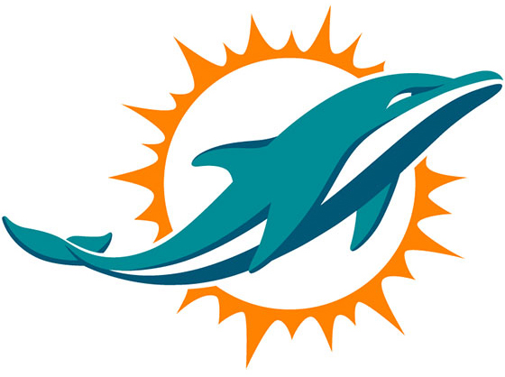
Miami's newest logo keeps some of the original design (well, there is a dolphin and a sunburst) but it's a radical departure from the original look. The streamlined logo is without a helmet for the first time as the dolphin was designed to look more as if it was breaking from the water and less like Flipper from the Miami Seaquarium. The shade of aqua was lightened toward the team's original look, although the dark blue from the previous redesign remained.
Produced by Kara Dapena
Comments
Which logo is your favorite?